Back to all releases
// January 5, 2025v1.16.0

Dashboard

Platform

Introducing Speakeasy Elements

Speakeasy Elements is a library of UI primitives for building chat-like experiences for MCP Servers. Speakeasy Elements chat demo The first release of Speakeasy Elements includes:
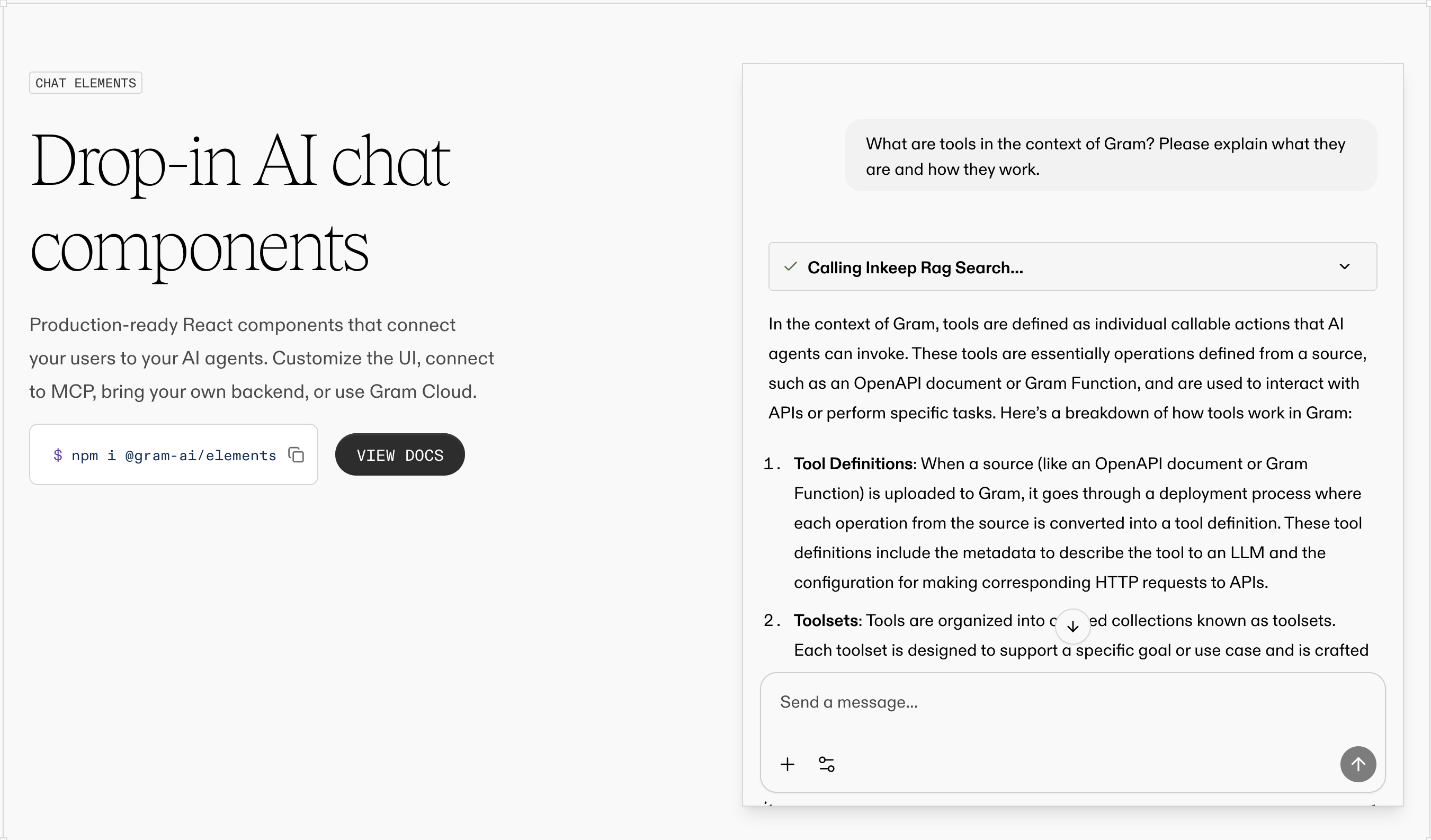
  • An all-in-one <Chat /> component that encapsulates the entire chat lifecycle, including built-in support for tool calling and streaming responses
  • A powerful configuration framework to refine the chat experience, including different layouts, theming, and much more

Getting started

Here's a preview of adding Elements to a chat application:
import {
GramElementsProvider,
Chat,
type ElementsConfig
} from '@gram-ai/elements'
import '@gram-ai/elements/elements.css'
const config: ElementsConfig = {
projectSlug: '{project_slug}',
mcp: 'https://ai.speakeasy.com/mcp/{mcp_slug}',
chatEndpoint: '/chat/completions',
variant: 'widget',
welcome: {
title: 'Hello!',
subtitle: 'How can I help you today?',
},
composer: {
placeholder: 'Ask me anything...',
},
modal: {
defaultOpen: true,
},
}
export const App = () => {
return (
<GramElementsProvider config={config}>
<Chat />
</GramElementsProvider>
)
}
Check out the Speakeasy Elements documentation to get started.
Speakeasy Team
Speakeasy Team
View on GitHub