Rebranding Speakeasy
Faraz Prentice-Khan
July 14, 2025 · 3 min read

Today, we’re excited to share Speakeasy’s new brand identity: a visual system built to match the precision of our current product and the ambition of our future vision.
Why rebrand now?
Speakeasy isn’t the same company it was a year ago. We started by simplifying SDK generation. Today, we’re powering the next frontier of software: agent-ready APIs.
As AI applications like Claude and Cursor reshape software development, APIs need to speak a new language. MCP (Model Context Protocol) has given AI the power to interact with the world via APIs, creating the potential for a tidal wave of productivity and creativity. But this only happens if the ecosystem has APIs ready to handle it. Speakeasy is becoming the MCP company to help every API platform successfully transform into an AI platform.
This shift demanded a new visual identity that could:
- Communicate our goal to help you “Craft exceptional API experiences”
- Give a taste of the refinement and purpose we put into our products
- Scale across new products like Gram, the fastest way to go from API to MCP Server
Finding our visual voice
How do you build a brand that speaks to who we are today and where we want to be tomorrow?
We build for engineers and teams who obsess over their craft, and the brand needed to reflect that.
We partnered with Basement Studio to develop what we call “Refined Tech”—a design philosophy that balances technical precision with the warmth of the Speakeasy community.
A symbol with layers
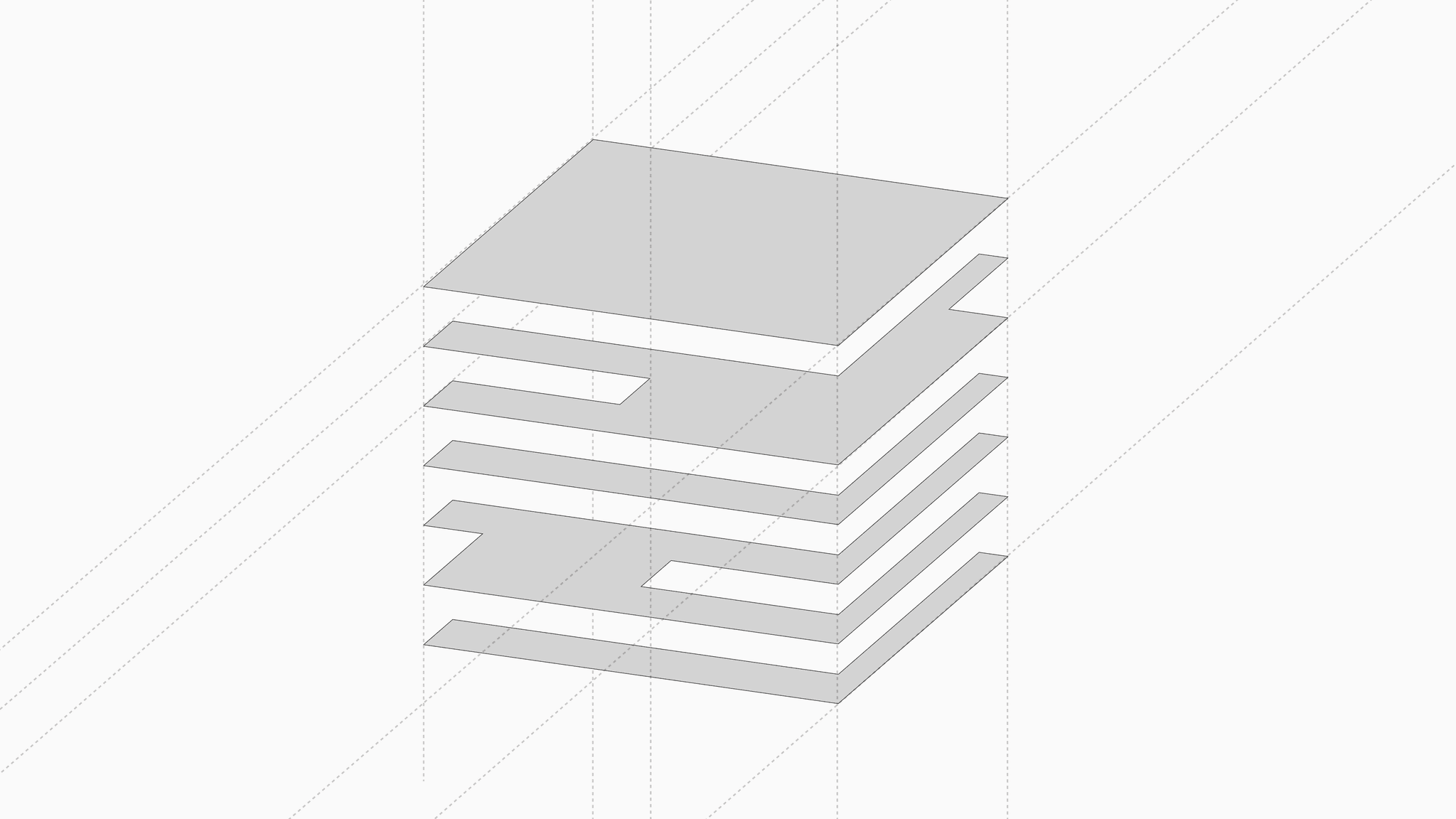
The logotype tells our story: stacked layers representing both “the tech stack” and the first letter of our name.
Evolution, not revolution
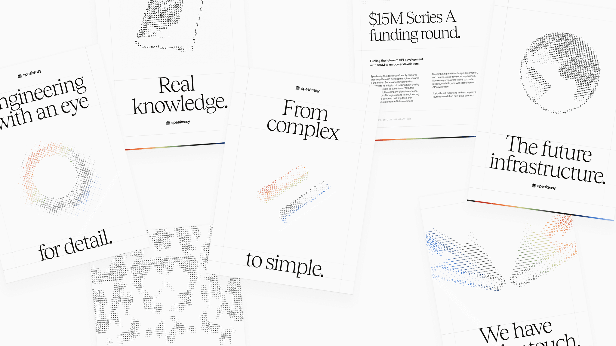
It was important to us that we didn’t lose the elements of our current brand we loved. We gave the slashes from our old logo a new home. Just about everywhere.
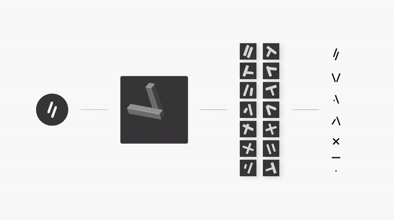
We took our original logo, re-imagined it in 3D space, and then ASCII-fied it. Giving us a way to add some retro joy to our site using animations that we felt represented our products—uncompromising quality, going the extra mile and a little bit of fun.
![]()
Bold messaging for a bold mission
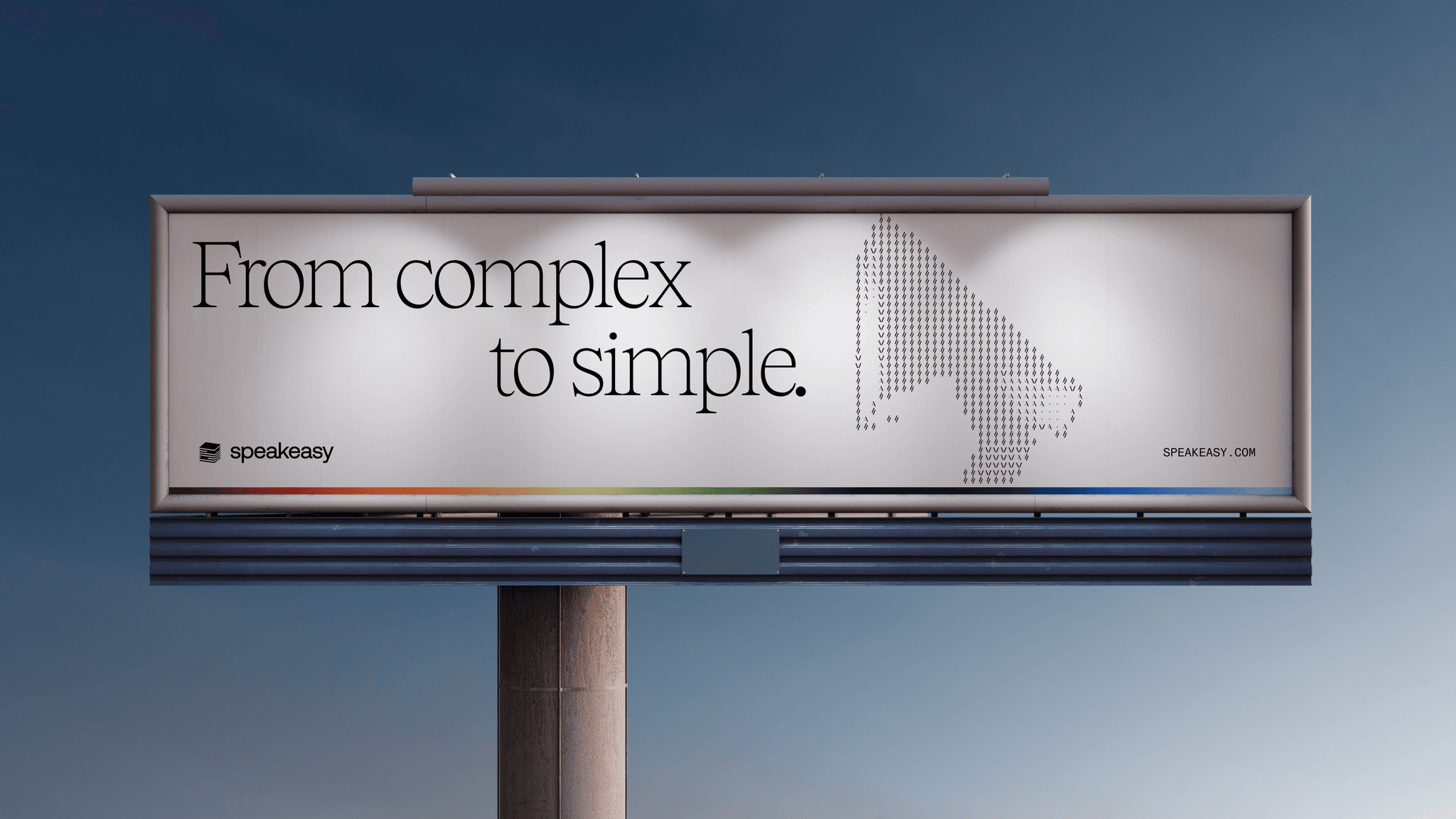
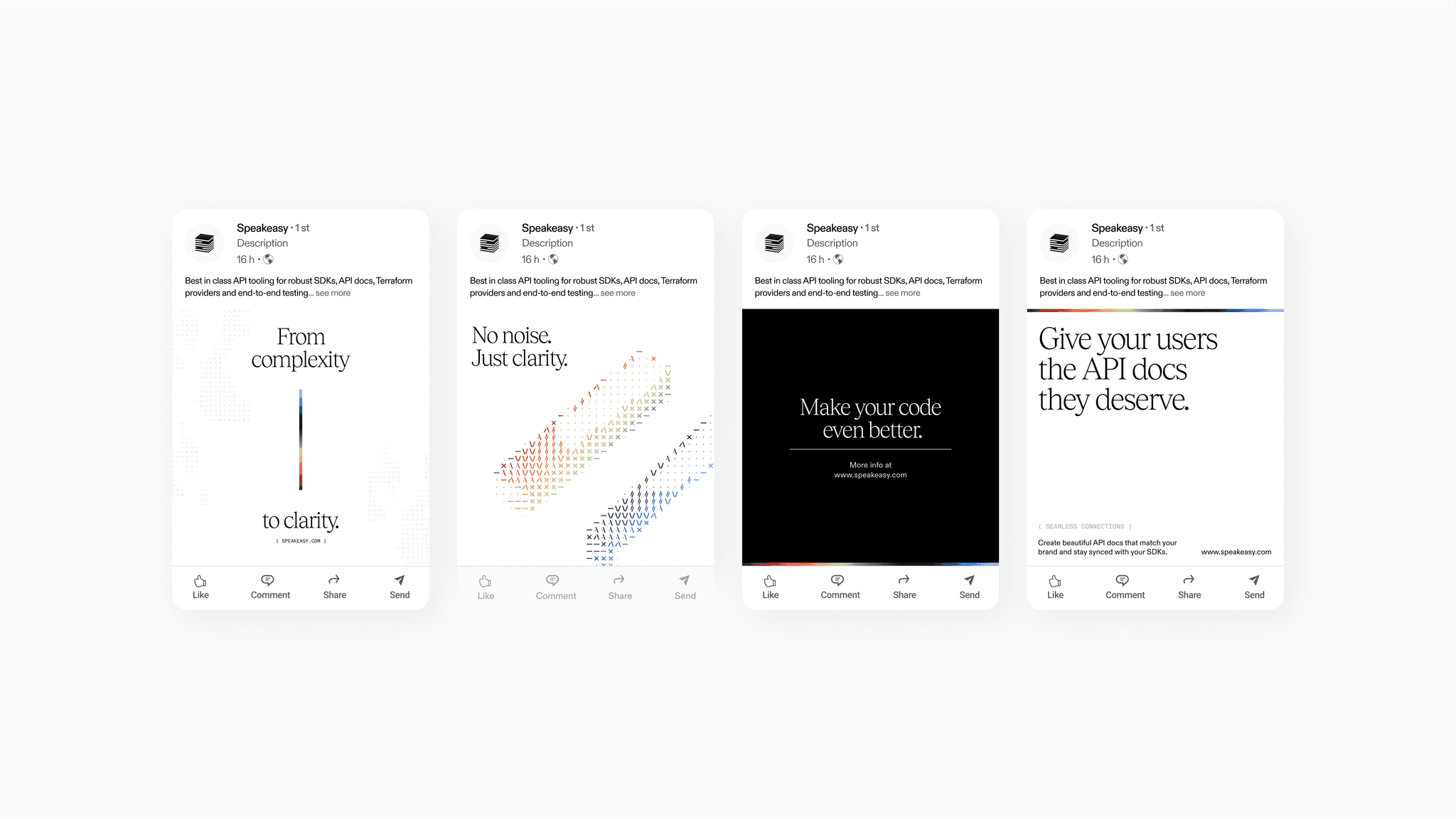
Our new brand was a chance to re-evaluate our voice. We’re not just another API tool—we’re the bridge to the agent economy and our new messaging reflects this.
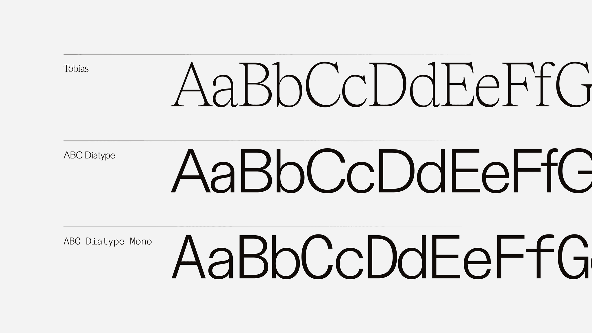
Type
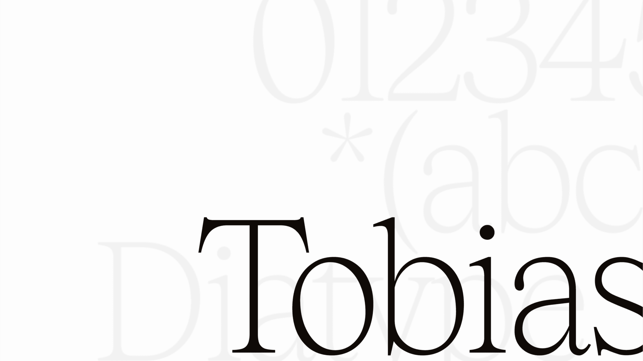
Headlines use Tobias a serif that’s got a bit of retro tech soul. It keeps things human. Supporting content leans on ABC Diatype and Diatype Mono a clean, structured, unmistakably technical font.
Color System
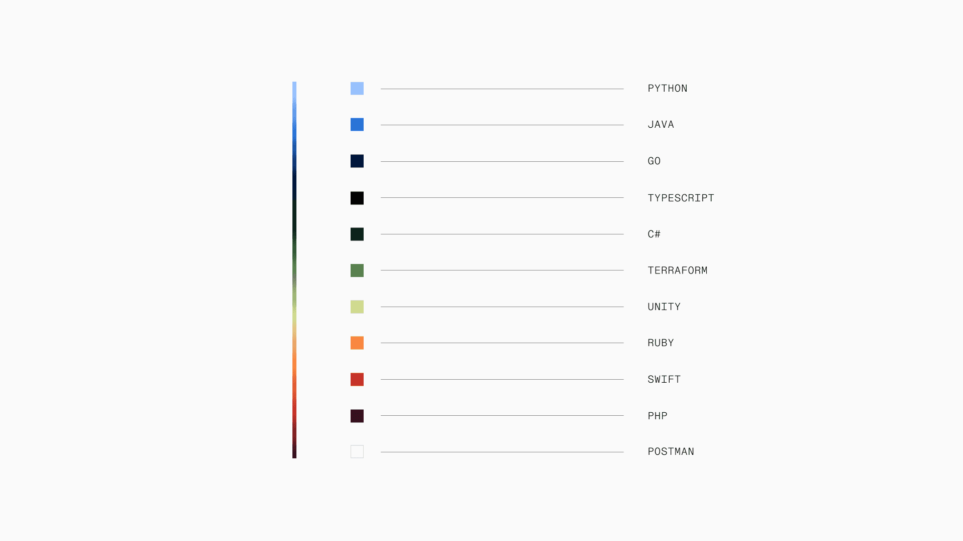
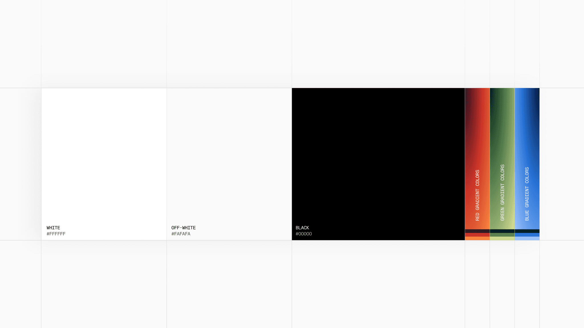
Our new palette was born out of utility. It was important that the brand extended naturally into our products.
The monochrome foundation gets out of your way when you need to move fast, while the RGB brand gradient was born from the colors we assigned to our SDK generation targets.
What’s next
This visual refresh is just the beginning. We’ve already started bringing the brand into the product with Moonshine; our utility-first design system, that we’ll share more about in an upcoming post.
We’re committed to building APIs that agents love and developers trust.
Thank you for being part of our journey.
Last updated on